2-8 #banner 動畫
- 動畫設定 : 詳本網站【4-15 animation ( 動畫 )】單元
- position : 詳本網站【3-8 position :自由定位 網頁排版】單元
參考連結:
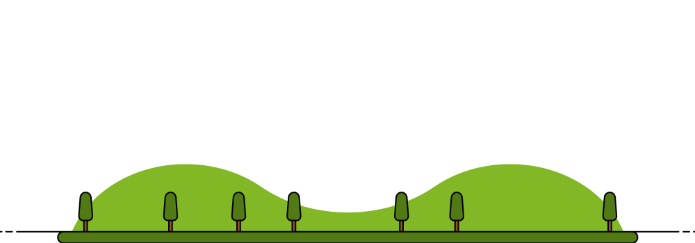
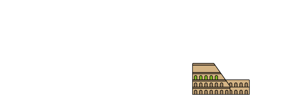
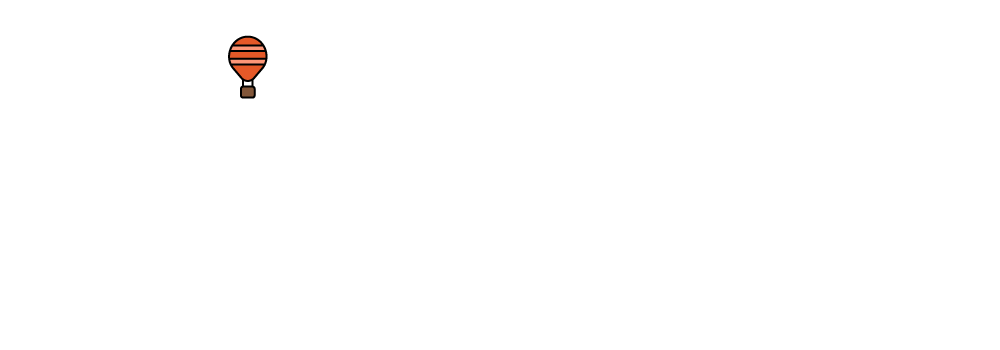
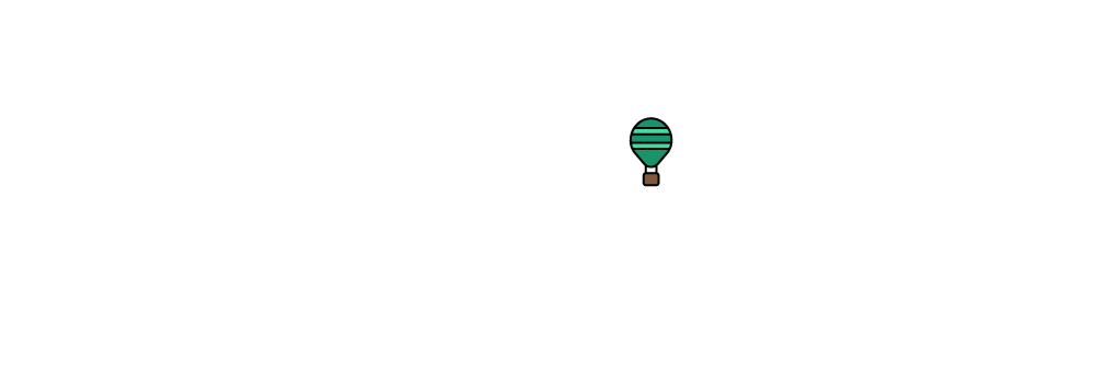
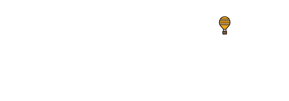
顯示結果:
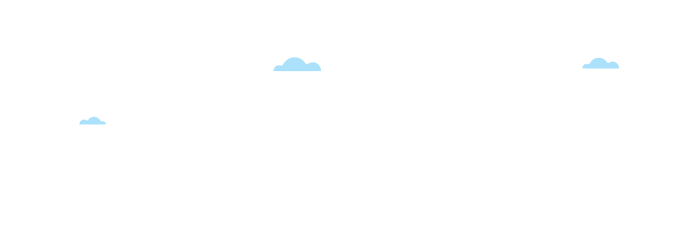
步驟
S1:增加 section #banner 區塊,加入所有圖片
減化課程重覆工作,故以下語法貼入網頁內,以利說明。
<section id="banner">
<div>
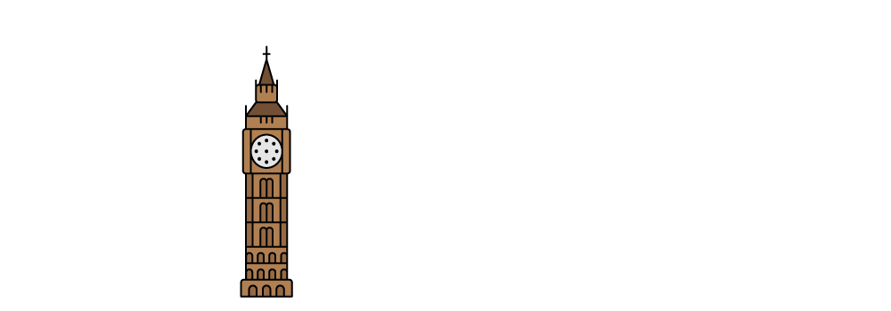
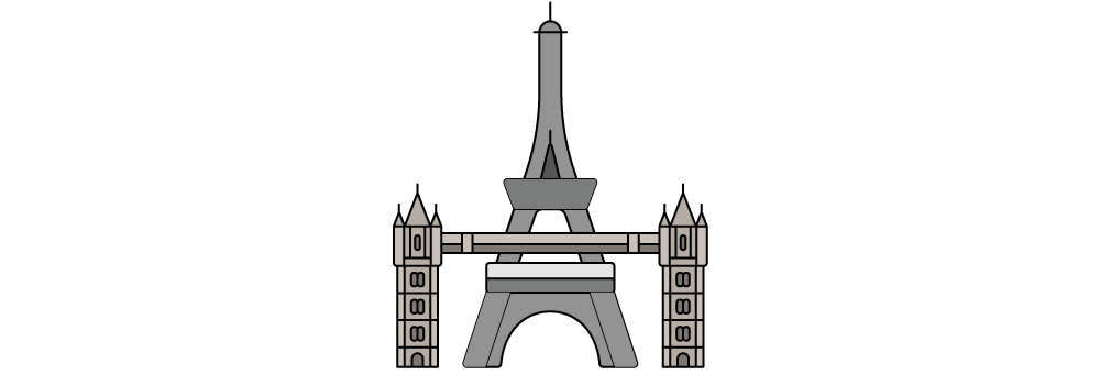
<img src="./img/banner/banner_bg.png" alt="" class="bannerbg">
<img src="./img/banner/banner_build1.png" alt="" class="build1">
<img src="./img/banner/banner_build2.png" alt="" class="build2">
<img src="./img/banner/banner_build3.png" alt="" class="build3">
<img src="./img/banner/banner_build4.png" alt="" class="build4">
<img src="./img/banner/banner_ballon1.png" alt="" class="ballon1">
<img src="./img/banner/banner_ballon2.png" alt="" class="ballon2">
<img src="./img/banner/banner_ballon3.png" alt="" class="ballon3">
<img src="./img/banner/banner_cloud1.png" alt="" class="cloud1">
<img src="./img/banner/banner_cloud2.png" alt="" class="cloud2">
</div>
</section>
S2:針對 #banner 進行基本CSS美化
  CSS 美化:
  /* section #banner 動畫 ========================= */
  #banner{
    position: relative;
  }
  #banner div{
    width: 1000px; height: 350px;
    position: absolute;
    top: 50%; left: 50%;
    transform: translate(-50%,-50%);
  }
  #banner img{
    position: absolute;
    left: 0; top: 0;
  }
S3:動畫設定
- animation-direction : alternate 說明,詳: w3schools(英) /runoob(中)
- animation-fill-mode : backwards 說明,詳: w3schools(英) /runoob(中)
參考連結:
設定三種動畫型態,利用時間差進行不同情形,故針對圖片進行class命名
  #banner div{
    overflow: hidden;               /* 動畫執行時,圖片從外部進場時不顯示 */
  }

  .bannerbg{ animation: opacityAn 1s; animation-fill-mode: backwards;}
  .build1{ animation: buildingAn 1s .5s; animation-fill-mode: backwards;}
  .build2{ animation: buildingAn 1.5s 1s; animation-fill-mode: backwards;}
  .build3{ animation: buildingAn .5s 1.5s; animation-fill-mode: backwards;}
  .build4{ animation: buildingAn 1s 1.8s; animation-fill-mode: backwards;}
  .ballon1{ animation: ballAn 2s -1s infinite alternate;}
  .ballon2{ animation: ballAn 1.5s -1.8s infinite alternate;}
  .ballon3{ animation: ballAn 2s -1.5s infinite alternate;}
  .cloud1{ animation: ballAn 3s 2 infinite alternate;}
  .cloud2{ animation: ballAn 3s -1s infinite alternate;}

  @keyframes opacityAn{
    0%{opacity: 0;}
    100%{opacity: 1;}
  }
  @keyframes buildingAn{
    0%{top: 100%;}
    100%{top: 0;}
  }
  @keyframes ballAn{
    0%{top: 0;}
    100%{top: 30px;}
  }
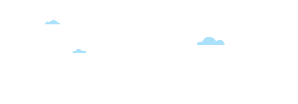
結果
html 結構
  <section id="banner">
    <div>
      <img src="./img/banner/banner_bg.png" alt="" class="bannerbg">
      <img src="./img/banner/banner_build1.png" alt="" class="build1">
      <img src="./img/banner/banner_build2.png" alt="" class="build2">
      <img src="./img/banner/banner_build3.png" alt="" class="build3">
      <img src="./img/banner/banner_build4.png" alt="" class="build4">
      <img src="./img/banner/banner_ballon1.png" alt="" class="ballon1">
      <img src="./img/banner/banner_ballon2.png" alt="" class="ballon2">
      <img src="./img/banner/banner_ballon3.png" alt="" class="ballon3">
      <img src="./img/banner/banner_cloud1.png" alt="" class="cloud1">
      <img src="./img/banner/banner_cloud2.png" alt="" class="cloud2">
    </div>
</section>
CSS 美化
CSS 美化:    <!-- 以下CSS美化,簡化不重要屬性值 -->
  #banner{
    position: relative;
  }
  #banner div{
    position: absolute;
    width: 1000px; height: 350px;
    top: 50%; left: 50%;
    transform: translate(-50%,-50%);
    overflow: hidden;
  }
  #banner img{
    position: absolute;
    top: 0; left: 0;
  }
  .bannerbg{ animation: opacityAn 1s; animation-fill-mode: backwards;}
  .build1{ animation: buildingAn 1s .5s; animation-fill-mode: backwards;}
  .build2{ animation: buildingAn 1.5s 1s; animation-fill-mode: backwards;}
  .build3{ animation: buildingAn .5s 1.5s; animation-fill-mode: backwards;}
  .build4{ animation: buildingAn 1s 1.8s; animation-fill-mode: backwards;}
  .ballon1{ animation: ballAn 2s -1s infinite alternate;}
  .ballon2{ animation: ballAn 1.5s -1.8s infinite alternate;}
  .ballon3{ animation: ballAn 2s -1.5s infinite alternate;}
  .cloud1{ animation: ballAn 3s 2 infinite alternate;}
  .cloud2{ animation: ballAn 3s -1s infinite alternate;}

  @keyframes opacityAn{
    0%{opacity: 0;}
    100%{opacity: 1;}
  }
  @keyframes buildingAn{
    0%{top: 100%;}
    100%{top: 0;}
  }
  @keyframes ballAn{
    0%{top: 0;}
    100%{top: 30px;}
  }